Tag Archives: art

Art-See: Romance

The Kiss by Klimt

The Kiss by Brancusi

Notice a trend? Forgive me, but I have weddings on the brain 15/7 (yeah it’s not quite to 24/7 yet, I do sleep and work and let my brain think about a few other things). Anyways, with a long-distance fiance and weekends spent planning out details for a day a year away (11/10/12!) I thought I’d put the romantic daydreams to some other use.

The Kiss by Brancusi is one of my favorite sculptures. Housed in the Nasher Sculpture Center in Dallas, it’s a squatty plaster cast of the original stone carving. The two people seem to be carved from one stone, symbolizing to me how husband and wife become one in marriage. And I love it’s simplicity and how you can see all around them but not their most intimate kiss.

Klimt’s The Kiss is equally sweet and intimate. It’s also so sensual and lavish (I’ll take a gold cape wrapped around me every time I’m embraced, thank you very much).

La Mariee by Chagall

It’s hard to talk about daydreams and fantastical love without including Chagall, the king of floating bodies, dreamy scenes and flat out random subject matter. La Mariee imagines a bride being fitted with her veil by her groom. A church and small town linger beyond them, while a musician serenades them both. Oh, and there’s a cello-playing goat and a lobster playing the xylophone. Is this the Little Mermaid’s wedding? I’ll probably have some dream along these lines in the next year.

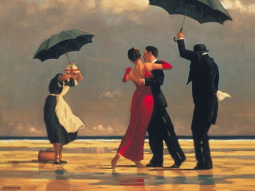
The Singing Butler by Vettriano

And maybe for our first dance we’ll have our maid and butler keep the rain away as we waltz around a beach. No? Well regardless, I’ve always loved The Singing Butler painting and found it lovely and whimsical. My favorite is the maid whose probably thinking, “Oh, these crazy people. Go dance inside.”

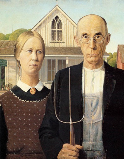
American Gothic by Grant Wood

To end on a more sobering note, Grant Wood’s American Gothic. Jonathan jokingly suggested that  this is “the way marriage really looks.” Ha. I know he was joking but I think it’s fair to group it with these artworks. Because every relationship is dreamy and intimate and lovely, but it’s also an everyday attitude of “we’re in this together, come what may.”

Leave a comment

Filed under Art Appreciation, Art History

Art-See: Autumn

The way I feel about Halloween is pretty much the way most people feel about Christmas: I soak up every minute of the month leading up to it, exclaiming, “It’s the most wonderful time of the year!” every chance I get. And then, when the 31st rolls around, I’m a little sad, because I know that it will be another 365 days until that special day returns again (and no, it has nothing to do with the fact that that day is also my birthday). To me Halloween isn’t the scary stuff and the tasteless costumes – it’s pumpkins, crisp leaves, cinnamon, youthful excitement, creativity and fall coziness. So in the spirit of enjoying all that fall brings, I’ve rounded up a few paintings that remind me of the season year-round.

1. Haystack (1938) by Thomas Hart Benton

On view at Museum of Fine Arts, Houston

Thomas Hart Benton always reminds me of Missouri (it’s where he was from, after all). His fluid paintings of  rolling hills and plains conjure up images of crisp fall days in the Midwest. This painting especially captures the feeling of autumn harvest.

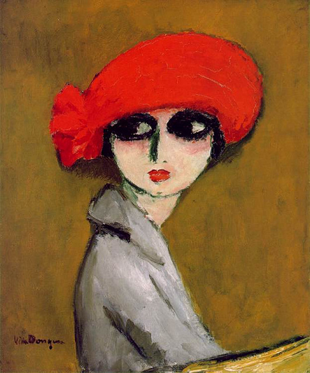
2. The Corn Poppy (1919) by Kees van Dongen

On view at Museum of Fine Arts, Houston

This is how I want to look in the fall. A lovely head scarf with a pop of color. Much like his Fauvist colleague Matisse, van Dongen’s works stand out for his bold color choices.

3. Apple Tree with Red Fruit (1902) by Paul Ranson

On view at Museum of Fine Arts, Houston

A non-traditional depiction of an apple orchard perhaps, but this painting has all the colors of fall. A bright sunset illuminates the sky with pops of red apples and wildflowers in the foreground.

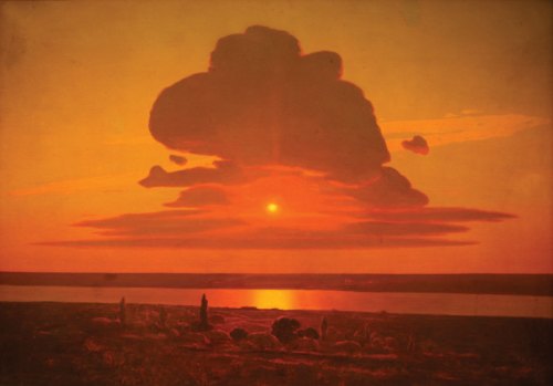
4. Red Sunset on the Dnieper (1905-8) by Arkhip Ivanovich Kuindzhi

On view at the Metropolitan Museum of Art

On view at the Metropolitan Museum of Art

The colors of a great sunset are the colors of fall to me: burnt orange, deep red, shady blues and purples. It’s also a symbol for the season: the ending of the day and the ending of a year.

1 Comment

Filed under Art Appreciation

100+

This summer has been so

Robert Cottingham's "Hot," on view at the Wichita Art Museum

One of my favorite ways to escape the sweltering heat these days is to step into a nice air-conditioned museum. Even better when the art ends up being themed around summer. On a recent visit to Kansas, I visited the exhibit Been in the Dark at the Wichita Art Museum, which showcased around 45 artworks that had been kept hidden in the Museum’s vaults for a number of years. It claimed to not be centralized on any specific theme but I loved finding a common thread among the works: whimsy, fresh fruit, melting ice cream, playful beach moments and countless other summer images. I hope to have a review of the exhibit on Review sometime in the coming weeks, but until then I leave you with some of my favorite works from the exhibit and invite you to take a break from the scorching sun and feast your eyes on some art in your area.

Adrian van Suchtelen's "Cherries"

Mmm, cherries. One of my favorite summer fruits. Also a reminder that I still need to make this.

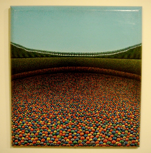
Steve Berman's "60 Million Gumballs With 10 Winners"

Don’t you just want to jump into this painting? It’s so colorful and bright.

Leon Kelly's "Silvia in Garden"

This is one of the most interesting paintings I have seen in a long time. I love that her body is depicted almost like a preying mantis while she tends her garden. I could just examine this picture for hours.

Robert Lazzarini's "Teacup"

This teacup looks like it’s melting from the heat! I feel your pain, teacup. I also want this sitting on my bookshelf. It’s so very whimsical.

Leave a comment

Filed under Art Appreciation, Review

SHOW ME Art for Good

By Hilary Clements and Rachel Hamblin/Courtesy of Moosylvania

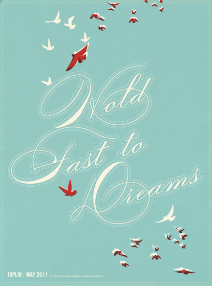
If you’re looking for a way to add some original screen print artwork to your walls AND want to do some good in the process, consider Moosylvania‘s limited edition screen prints benefitting relief work in Joplin, Mo. All proceeds from the $25 posters go to help the United Way Small Business Fund for Joplin, a program to help rebuild the economy in this tornado-struck Missouri town. Each poster has a certain rustic quality to it and a piece of Missouri heart, such as Joplin-born poet Langston Hughes’ verses (like in the poster above) and images of the dogwood tree and bluebird. For more information on Moosylvania, the posters and how you can get one (or more) on your walls, visit here. The sale closes on June 20.

By Jacob Etter/Courtesy of Moosylvania

By Skylar Salisbury/Courtesy of Moosylvania

By Christian Lindsey/Courtesy of Moosylvania

Leave a comment

Filed under Art Appreciation

Guest Post

Most of us follow particular blogs because we value the bits of knowledge they offer us, from tips on cooking to fashion advice and every nugget of wisdom in between. We also rarely realize how many “experts” live among us and around us. One of my friends had the great idea of compiling the little bits of expertise that each of us can offer the world into weekly “Expert” Advice blog posts. We use the term “expert” loosely because we don’t claim to know everything about any given topic. But we also recognize that each of us has unique know-how about the world. This week I offer my tips on how to visit an art museum (and enjoy it).

Leave a comment

Filed under Art Appreciation

Seasonal: The Last Supper

For centuries, art was associated with religion. From murals and frescoes to altar paintings, scripture was depicted throughout art. With Lent culminating at the end of this week with the celebration of Easter, I thought it fitting to compare three depictions of the ubiquitous Last Supper scene as painted by Andrea del Castagno, Tintoretto and, of course, Leonardo da Vinci to show how the same event can be portrayed so differently in mood and appearance.

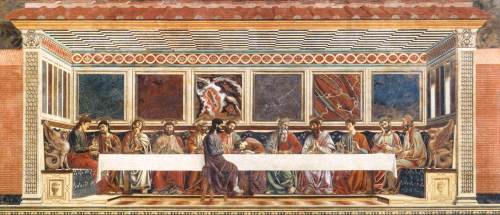
Last Supper

Andrea del Castagno, Last Supper, fresco, Florence, Italy, 1447

This fresco (a painting done on wet plaster so it penetrates the wall as it dries) was fittingly painted in the dining hall of a convent in Florence (how would you like to be reminded of this scene every time you ate supper?) Besides focussing on the narrative, Castagno was also interested in showing a great deal of perspective in the painting. Exploring this painting technique was prevalent throughout 15th-century art. Now, religious art is chock full of symbolism and a pretty easy place to get one’s bearings in the art world. My go-to symbol in Last Supper paintings is Judas. Yes, he betrayed Jesus, so he’s not on my favorite people of the Bible list. But because of that role, it’s usually most interesting to see what the artist does with him. Here, Castagno doesn’t hide anything: Judas is bad, he doesn’t get to sit by anyone else, put him on the other side of the table. Simple.

Last Supper

Leonardo da Vinci, The Last Supper, tempera on gesso, Milan, Italy, 1495-1498

Now, for one of the most reproduced paintings of all time, Leonardo’s The Last Supper. Roughly 15-by-29 feet, the work is truly huge. This painting is a study of balance and focus, with perspective only heightening the importance of certain elements. Namely, Jesus is clearly at the center of the event with all visible and spacial lines directed at him. Where’s our go-to Judas? He’s not as clearly the “bad guy” in Leonardo’s work, but fourth from the left, he’s still a little removed (in appearance and posture). We also can’t forget to observe John directly next to Jesus; in both these Last Supper scenes he’s swooning or fainting. It’s perhaps because he’s the youngest apostle (it’s also given historians plenty to study and wonder about for centuries). Do you see how we’re picking up drama in these paintings, though? To me Castagno’s work almost seems like they’re all sitting around at a local restaurant, just another day. Here, we see a bit of momentum; people are gesturing and gasping. They’re reacting. Which brings us to Tintoretto.

Last Supper 2

Tintoretto, Last Supper, oil on canvas, Venice, Italy, 1594

Wow. You would think this wasn’t even the same scene. To me, here the drama is palpable. There is no longer the balance and harmony of the previous two works. Jesus and the 12 apostles are not alone in a quiet space. The table is at a jaunting angle that immediately directs your eye to the central Jesus (if the illuminated halo didn’t do the trick). There’s dramatic lighting and shadows – not to mention celestial beings flying overhead – that play up the unfolding drama. I don’t even know where Judas is in all of this (although my best guess is that he’s the one guy kneeling down near Jesus without a halo). In the history of art, this painting is also a transition from the neutral lighting and clarity of space of the Renaissance to the dramatic chiaroscuro (an effect of contrasted light and shadow) of the approaching Baroque period.

Whose to say which work is the most “accurate.” They each highlight elements of a pivotal scene in the gospel, though, and collectively tell a greater story of the ultimate sacrifice.

Leave a comment

Filed under Art Appreciation, Art History

Painting vs. Sculpture

One of my favorite ways to think about art is to form connections between artists and works. That way, even if I don’t “like” it, I can still consider it and give it some thought. After all, the movement of art history is all about the ways artist react to their predecessors, are influenced by them or comment on them.

Artist John C. Wagoner currently has an exhibit at Artspace called Made Out of Paint. He references Leonardo Da Vinci’s “Treatise on Painting,” which debates whether painting or sculpture is most superior (Da Vinci concludes that it is painting). WIth his so-called “paint sculptures,” Wagoner strikes up this debate again. Although I don’t personally think one art form is superior to another, I enjoyed Wagoner’s take on the subject.

My favorite thing was seeing the clear references Wagoner’s pieces made to works by Claes Oldenburg and Jasper Johns.

Wagoner’s food, drinks and tablecloth made with paint (above)

Notice the Balantine Ale in Wagoner’s work; here, Jasper John’s Painted Bronze (1960)

Part of Claes Oldenburg’s The Store (1961)

Other objects Wagoner sculpted include head busts, books, paintbrushes and frames (below).

Johns’ other Painted Bronze piece (left)

It’s clear that Wagoner continues an ongoing discussion of painting vs. sculpture. Whereas Johns simply painted his bronze sculptures, Wagoner takes it a step further and completely blurs the line between the two mediums. The typical sculpture sits on a floor or podium; a painting is usually hung on a wall. Wagoner does both with his pieces; so are they paintings or are they sculptures? Does it matter, and is one better than the other?

Leave a comment

Filed under Art Appreciation, Review

A Day at the Museum

I don’t live too far from the Norton Art Gallery and visit it rather frequently. But truth be told, 95% of my visits are spent outside with art that looks like this

It’s one of my favorite places to walk especially during springtime when azaleas are in full bloom. But today Mom and I ventured inside to see the Great Masters of Cuban Art exhibit on view until June 6. I’m happy to say I was pleasantly surprised at the quantity and quality of artwork that was featured. There was a nice variety of subject matter and time periods represented, too. Here were some of the highlights for me:

Jose Maria Mijares, Sueno en el puerto (Dream of the Port), 1943, oil on canvas

There is so much going on in this painting, which is part of what I love about it. A few things struck me right away, though. The colors seem subdued and monotone at first glimpse, but there are little bursts of colors peeking out that seem to signify the dream trying to break through of a bleak and mundane day. The narrow, long faces of the young women reminded me of how Amedeo Modigliani often painted his female portraits, with those unnerving hollow eyes. And I couldn’t help but think of Mr. Cubism himself, Pablo Picasso, because of the angularity and overlapping nature of the seaside buildings in the background.

Angel Valdes, Guateque, 1940, oil on canvas

A lot of what makes me like this work is that it reminds me of Thomas Hart Benton paintings. The figures aren’t quite as elongated as those in Benton’s paintings, and it’s missing that curvy and billowy landscape, but the thick wrinkles of clothing and facial muscles seem sculpted. And that’s so very Benton.

Domingo Ravenet, Escena de circo (Circus Scene), 1944, oil on canvas

The dreamy quality of this painting makes me want to hang it in my bedroom. It also reminds me of Chagall, but I can’t for the life of me find a painting of his that is comparable. Maybe it’s just the dreamlike quality that his works give off, too. We’ll leave it at that.

Juan Gil Garcia, Naturaleza muerta (Still Life), 1926, oil on canvas

Confession: I’ve never been crazy about still life paintings. But the other day I started reconsidering them and what they can represent. I happened to notice my pearl ring and earrings stacked together haphazardly on a table, a common enough sight, but as I considered them I thought how very me those objects and their placement are. In this work, the chewed and smoked cigar lying on a newspaper beside a half-peeled fruit paint a portrait of someone and his everyday routine.  There’s more I want to say about this topic, but I’ll save it for another post. For now, this painting was worth mentioning for me because it reminded me to reexamine a genre of art I’d prematurely cast aside.

Leave a comment

Filed under Art Appreciation, Review